The Sustainable food trust
The Sustainable Food Trust (SFT) contacted me to assist in developing their logo/brand identity. The remit was that it must be a classic design that HRH the Prince of Wales would sign off on, yet be modern enough that it did not feel ‘stuffy’. Firstly, it had to convey a sense of environmental conservation. Secondly, it should express globally reaching communication and collaboration.
My final logo submission used a yin/yang ‘leaves’ combination, with the veins of the leaves alluding to longitude/latitude lines on a globe. The ‘S’ of sustainable was also captured in the negative space. After several years the charity positioned itself as more of a voice for change, and they updated the logo to convey this.
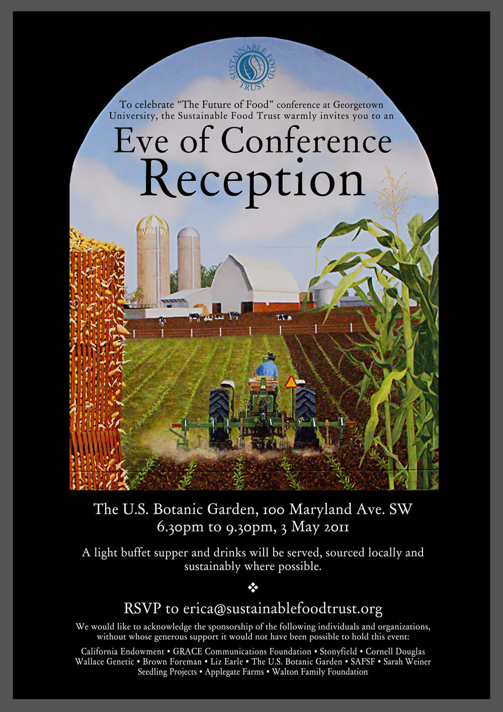
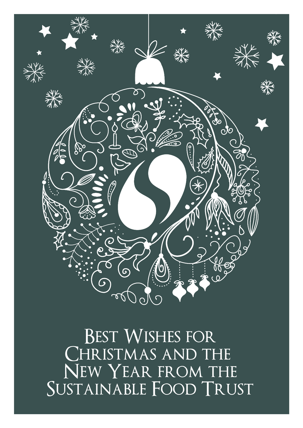
Below is a selection of the design work I have created for them over the years.


