Anglo Indian Chef Packaging
In 2014, Anglo Indian Chef commissioned me to create a logo and series of packaging designs for them. They were a new entry into the UK home-cook curry scene.
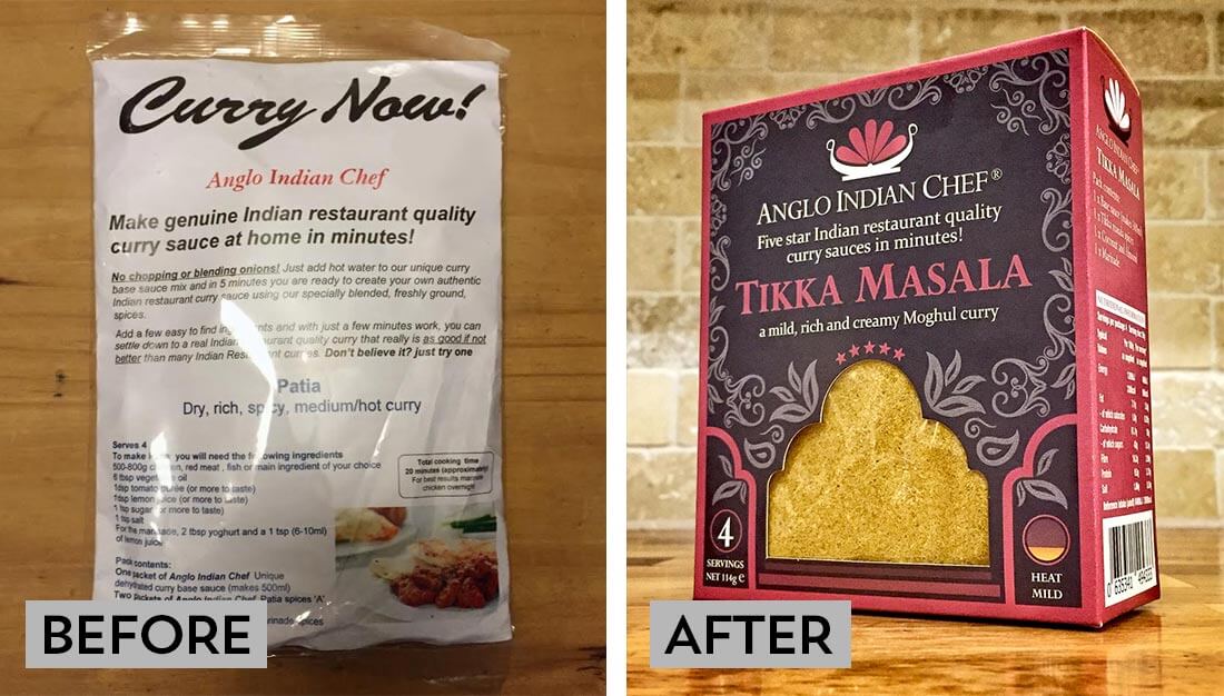
The original packaging was somewhat basic (seen on the left), and the entire branding needed an overhaul to be ready for a push into retail stores. Inspired by the traditional Karahi Pan, the logo used the flower petal designs connoting the explosion of flavour from each dish. I intended the colour of the petals, along with the packaging accent, to change depending on the spices used in the curry.
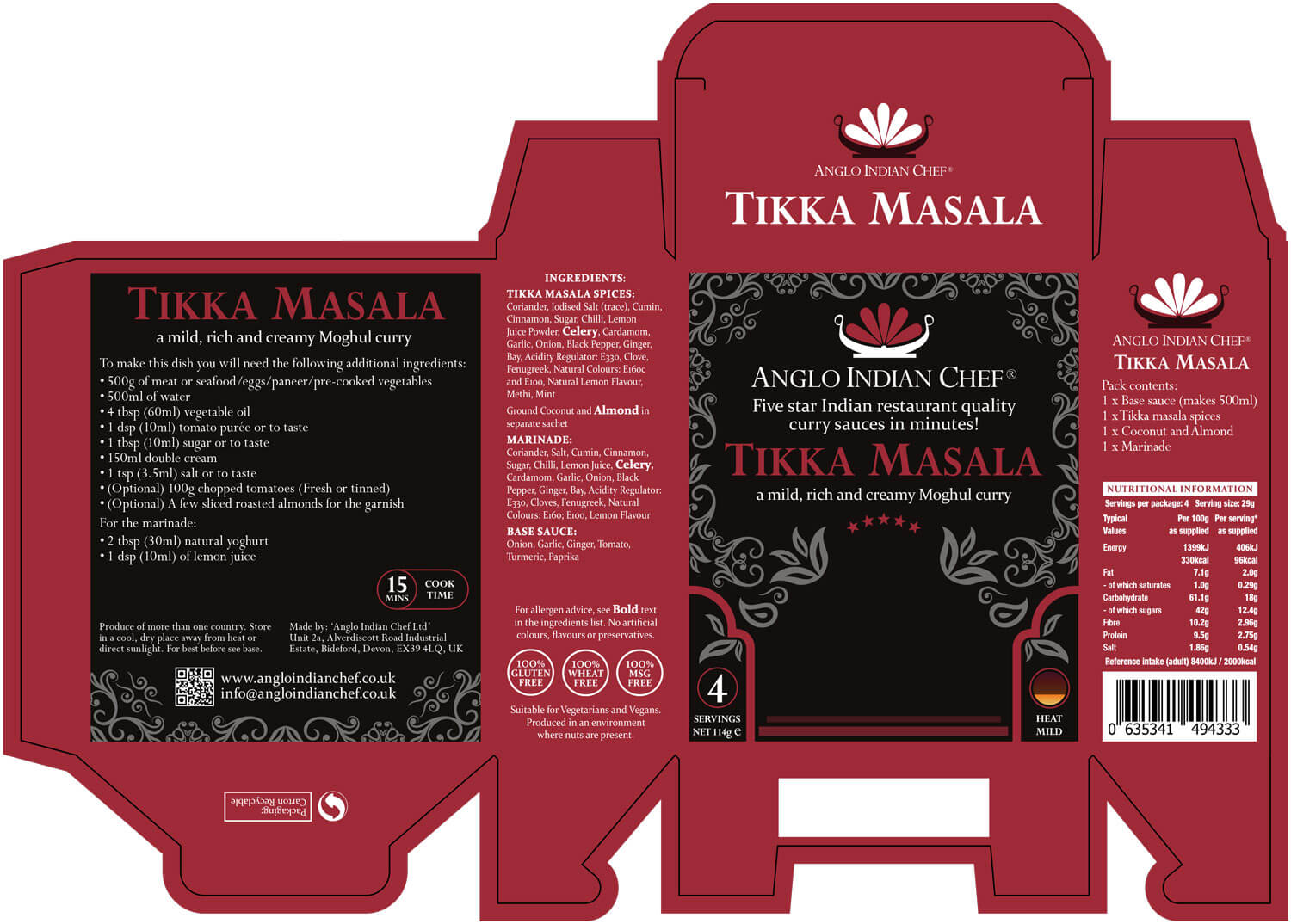
I began by researching Anglo-Indian motifs and architecture, which informed the shape of the cutout window. For me, this was central as it displays the rich and varied colours of the spices central to the client’s product. I chose two fonts, ‘Constantia’ and ‘Perpetua’ for their classical English serif style, and legibility at a small x-height.
On the front of the original packaging I needed to simplify the excess of information. I needed to re-situate this across the new box shape, including nutritional information and ingredients. It also had to meet current European Guidelines. The client wanted to include the recipe instructions in a larger print, and we felt this would be better placed inside the box. This became a spring folded insert that doubled up to push the content towards the front of the packaging. The solution ensured content visibility in the window and minimised disturbance in transit.
Once I had finalised the 13 different designs with the Anglo Indian Chef I worked with the printing/cutting company. I ensured that the design met their requirements for manufacture, and that there were zero mistakes.


