


-
ABOUT
-
CAREER
-
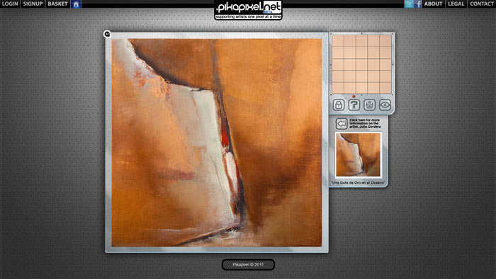
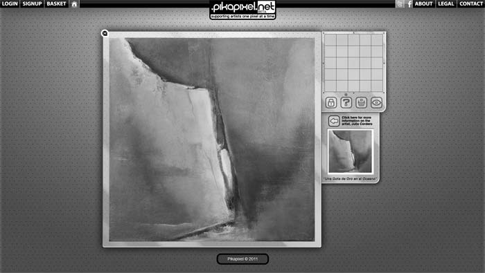
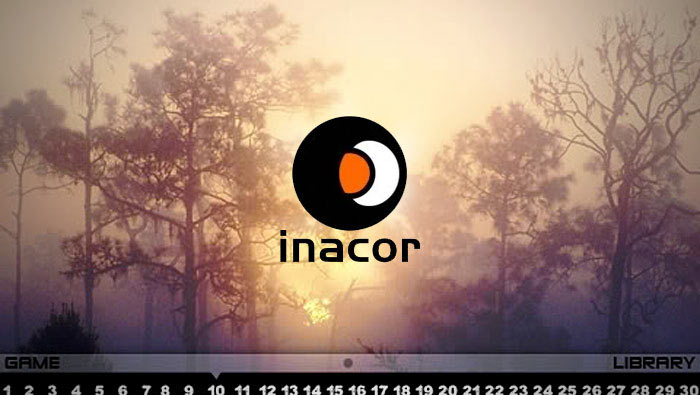
WORK
-
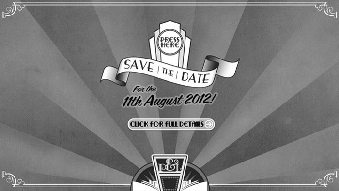
TALK
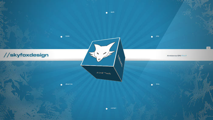
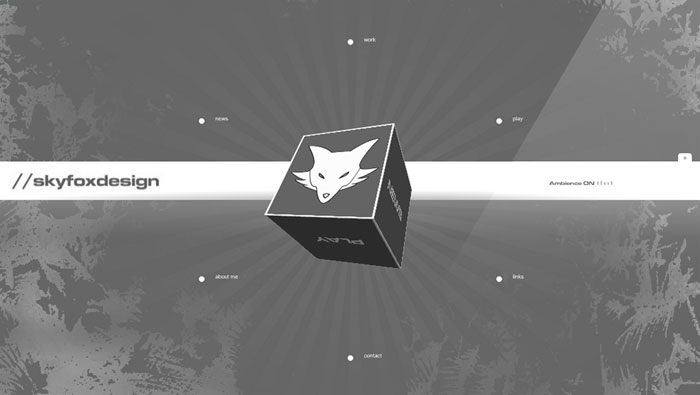
SKYFOX
DESIGN
i'm piers elliott- graphic designer / web designer / photographer / artist currently living in hampshire.
Skyfox Design is the company I created 10 years ago to be the front
for all my professional work.
Graduating preschool at the age of 5, I grew up wanting to be a time-traveller,
a pirate and at one point a dinosaur. I realised early on that realistically
-career-wise- some of these were off the table, so instead I picked up
some pencils and drew myself as them. This began a lifelong interest in
the world of design and media.
. . .
Finishing School with their highest accolade for Art, I studied Graphic
Design at college, finished a foundation course in Art then went on to
study Graphic Design with Animation at University in Bristol.
Over the last 10 years I have worked with a variety of clients as brand
consultant, from small start-ups and bars, to large charities and festivals. I
believe that all businesses (big or small) should have a memorable, unique brand
that will stand out from the crowd. That's why I do what I do. Vivid identities,
user-friendly interfaces, clear communication and a focus on the details.
. . .
In my spare time I like to read, play frisbee and cycle. When I'm not doing these, you'll often find me sitting in front of old star trek or stargate reruns. I like learning new skills. I like to create things. I like photography. I like long walks on the beach. I like a cold beer after long walks. I like films, especially those featuring Bill Murray. I like science. I like typography. I'm a massive old school graphic adventure affacionado. But above all else, I love good design.